
 Sign in to Mod The Sims
#1
 15th May 2014 at 12:13 PM
Last edited by BubblesO : 15th May 2014 at 12:53 PM.
15th May 2014 at 12:13 PM
Last edited by BubblesO : 15th May 2014 at 12:53 PM.
15th May 2014 at 12:13 PM
Last edited by BubblesO : 15th May 2014 at 12:53 PM.


Advertisement
#2
15th May 2014 at 12:21 PM
15th May 2014 at 12:21 PM

#3
15th May 2014 at 2:04 PM
15th May 2014 at 2:04 PM
#4
15th May 2014 at 2:08 PM
15th May 2014 at 2:08 PM
#5
15th May 2014 at 2:44 PM
15th May 2014 at 2:44 PM
#6
15th May 2014 at 3:26 PM
Last edited by parrot999 : 15th May 2014 at 8:30 PM.
15th May 2014 at 3:26 PM
Last edited by parrot999 : 15th May 2014 at 8:30 PM.
#7
15th May 2014 at 4:29 PM
15th May 2014 at 4:29 PM
#8
15th May 2014 at 5:14 PM
15th May 2014 at 5:14 PM
#9
15th May 2014 at 5:51 PM
15th May 2014 at 5:51 PM
#10
15th May 2014 at 6:06 PM
15th May 2014 at 6:06 PM

#11
15th May 2014 at 6:46 PM
15th May 2014 at 6:46 PM
#12
15th May 2014 at 6:53 PM
15th May 2014 at 6:53 PM
#13
15th May 2014 at 7:34 PM
15th May 2014 at 7:34 PM


#14
15th May 2014 at 8:21 PM
15th May 2014 at 8:21 PM
#15
15th May 2014 at 8:26 PM
15th May 2014 at 8:26 PM

#16
15th May 2014 at 8:40 PM
15th May 2014 at 8:40 PM
#17
15th May 2014 at 11:47 PM
15th May 2014 at 11:47 PM
#18
15th May 2014 at 11:51 PM
15th May 2014 at 11:51 PM
#19
15th May 2014 at 11:52 PM
15th May 2014 at 11:52 PM

#20
16th May 2014 at 12:17 AM
16th May 2014 at 12:17 AM
#21
16th May 2014 at 12:30 AM
Last edited by Simmer9000 : 16th May 2014 at 12:35 AM.
Reason: Grammatical Mistakes...
16th May 2014 at 12:30 AM
Last edited by Simmer9000 : 16th May 2014 at 12:35 AM.
Reason: Grammatical Mistakes...
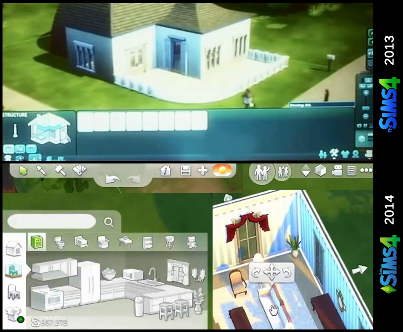
 . It may be a little cluttered and standoffish at first, but with some playing time, I'd get used to it quick. The whole thing feels more organized than the other games prior, which is a plus.
#22
16th May 2014 at 12:49 AM
16th May 2014 at 12:49 AM
#23
16th May 2014 at 1:53 AM
16th May 2014 at 1:53 AM
#24
16th May 2014 at 1:53 AM
16th May 2014 at 1:53 AM
#25
16th May 2014 at 2:14 AM
16th May 2014 at 2:14 AM
|
Page 1 of 2
|
|
|
|