Hi there! You are currently browsing as a guest. Why not create an account? Then you get less ads, can thank creators, post feedback, keep a list of your favourites, and more!
Quick Reply
Search this Thread
Wiki Wizard
#226 Old 26th Jan 2009 at 5:01 PM
Haha orchid, i love the hampster! Neat work, i think you should definitely go for the bold text, but i prefer the | instead of . that would be a neat combo, just my oppinion though


It's ok, we all laugh-snort occasionally!
Check out some of my other stuff here.
Advertisement
Test Subject
#227 Old 26th Jan 2009 at 5:25 PM
I think it is unmistakable, the logo will be a mix of many projects...
for the name of the mascot, I have few ideas, perhaps Modsy , but I think it's the job of the community too
VisualPallet gave good propositions
Test Subject
#228 Old 26th Jan 2009 at 7:09 PM
with nomalised size, an other font, and backgroud gradient, maybe better...


Warrior Gryphon
site owner
Original Poster
#229 Old 26th Jan 2009 at 8:18 PM
Hrm, blendy, I think the text blends in too much - perhaps add a border effect around the text itself.

Story books are full of fairy tales, of Kings and Queens, and the bluest skies.
Forum Resident
#230 Old 26th Jan 2009 at 9:30 PM
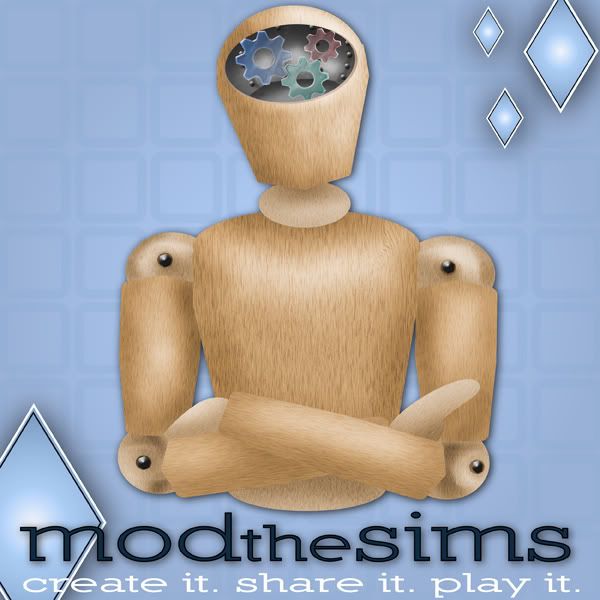
Trying to work in gears and a darker typeset. I'm still working on other ideas, but I thought I'd see if I can get some feedback. Thanks everyone!


Oh, and yes, the diamonds are still there. I'm still working on a lightbulb in Illustrator.
Warrior Gryphon
site owner
Original Poster
#231 Old 26th Jan 2009 at 9:52 PM
Love the darker typeset but not sure about the gears in the head....

Can you do up some banners and other image sizes too?

Thanks

Story books are full of fairy tales, of Kings and Queens, and the bluest skies.
Forum Resident
#232 Old 26th Jan 2009 at 10:20 PM
Thanks for the feedback, Delphy! I'm planning on doing banners for everything, I'm just playing around with images right now to get an idea which direction to go. I have a couple more ideas--it's just a time factor. I'll do them up as soon as I can.

Thanks!
Wiki Wizard
#233 Old 26th Jan 2009 at 10:36 PM
I am loving the designs Blendy Really unique and interesting designs!


It's ok, we all laugh-snort occasionally!
Check out some of my other stuff here.
Warrior Gryphon
site owner
Original Poster
#234 Old 26th Jan 2009 at 11:36 PM
blendy, Looking at the little mascots some more, I get the feelign that the MTS one should be doing... something. The S-C one is talking, the Sims Adult is posing and the Wiki one is taking over the world... but the MTS one is just standing there. Not sure what he could be doing though...

Story books are full of fairy tales, of Kings and Queens, and the bluest skies.
Test Subject
#235 Old 27th Jan 2009 at 12:47 AM
Holy Cow! Blendy's Logos Look Amazing! Nice work

Ok, Now i gotta start! lol
Meet Me In My Next Life
#236 Old 27th Jan 2009 at 12:52 AM
Quote: Originally posted by Srikandi
Love looking at all the logo ideas I'm very taken with the mascot, I have to say, but they're all great!

Simonut, you don't have to worry about losing control; there's an option to turn off universal aging.


Not sure about that, from what I have read the aging off and on will not apply to Sim3. All the cheats you use in Sims2 will become useless in Sim3 from what I have read So I do not know if this is so or not I only read this,that EA have did a whole new files thingee on Sims 3. Thanks Srikandi for your comment.

"Nothing in life is a Surprise it just happen to come your way at the time".
Test Subject
#237 Old 27th Jan 2009 at 1:06 AM
i love et!
Test Subject
#238 Old 27th Jan 2009 at 3:14 AM
Hello Guys

Thank you for the reassurance as I am crazy about this site and all it offers to me!!!!!!
Test Subject
#239 Old 27th Jan 2009 at 3:49 AM
I was gonna make it but the competition here is too hardcore xD

Is Trull. Is good.
Lab Assistant
#240 Old 27th Jan 2009 at 5:50 AM Last edited by Black0rchid : 27th Jan 2009 at 8:52 AM.
Quote: Originally posted by Delphy
BlackOrchid, Hrm, okay yeah you are right - the less bold "Create" text doesn't work well with the other parts of the logo. Thanks for obliging me on this one though
Love the hamster!


Quote: Originally posted by Delphy
Here's a challenge for everybody (just a thought I had in my head):
Take the mascot idea, and combine it with either gears or the lightbulb. Have the mascot sitting on/leaning against/resting on the gear/bulb and see how that turns out?


personally I disagree.
A logo must be simple and neat for recognizability. Combining two elements or more than one symbols, we run the risk to create something complex for who views it, something that eyes detect in a difficult way, unless we stylize them a lot.
Considering that mts logo has IMAGE+TEXT+PAYOFF, we have already 3 elements: I wouldn't make a complex image that mess up the readability.

IMAGE
gears, bulb, mascot:
I've already expressed my opinion about gears.. they are too "wip" and old. Gears recall old concepts. who works like me in design or web design certainly remembers the enormous use of that symbol everywhere, to mean "coding", "work in progress", etc, in old websites. It's a symbol I consider overworked. Also mascot is used everywhere (msn, etc) but I like blendy mascots (good work blendy!), they are a cute idea, but they are layouts, not a logo yet. So for mts logo we can use mascot+text+payoff, if preference is mascot, but pay attention at this:
a web-community logo is, for the 80% of cases, visualized in a small or very small dimension, like the banner here at the top. Sometimes is visualized in micro-banners that reproduce only the symbol + microtext.
Constrain blendy's layouts in a such of small sizes could spoil their beauty, for the way they are built (3d style). For a logo that has a priority use in web, it's better begin creating in small and after pass to high res. Working with small size guarantee a good return on web: not all images created big can be reduced well (sometimes they become less recognizable, try to reduce the Mona Lisa at 40x40px )

TEXT
Text should be not binded by background, and preferably external to symbol (but this is subjective)
But it would be better that logo could stay on various background, for future uses, or for different banner uses

CONSIDERATIONS:
In my opinion, best results can be reached with:
bulb+text+payoff
mascot+text+payoff. (with mascot created in small)
If the wish is to create a mascot+bulb, symbols must have same style (or both in 3d as blendy's or both in vector as mine, or pixelart/glossy/whatever) and very stylized

Personally, I told above, I don't like both symbol, so, take freely my idea and bulb for experiment with new design.

Bulb is an idea that can have potentially varied uses ("replacing" the plumbob), for this reason it convinced me. As plumbob recall TheSims wherever you put it, as the particular "stress" recall "nike" wherever you put it, as this particular blue bulb could recall mts wherever you put it.
The symbol itself could live alone, or over something also different from modthesims text.

@kweeky: yes, illustrator and photoshop

P.S. sorry if my way of speaking seems raw, but it's difficult for me writing well this concepts in english. Here in italy my job colleagues told me that when I speak english i am brutal :D
Test Subject
#241 Old 27th Jan 2009 at 7:14 AM
I absolutely LOVE Black0rchid's designs, but I thought I'd throw in my 2 cents:


I realize they're not quite as "shiny" as some of the others, but I believe they are very graphic (in a good way). <3

And an example of the banner:


Comments and suggestions are completely welcome.
Wiki Wizard
#242 Old 27th Jan 2009 at 7:25 AM
I really like them Very interesting designs!


It's ok, we all laugh-snort occasionally!
Check out some of my other stuff here.
Warrior Gryphon
site owner
Original Poster
#243 Old 27th Jan 2009 at 1:31 PM
Interesting designs, yaar, but unfortunately you got the site names mostly wrong :P

Story books are full of fairy tales, of Kings and Queens, and the bluest skies.
Forum Resident
#244 Old 27th Jan 2009 at 4:14 PM Last edited by sweetswami77 : 27th Jan 2009 at 5:20 PM.
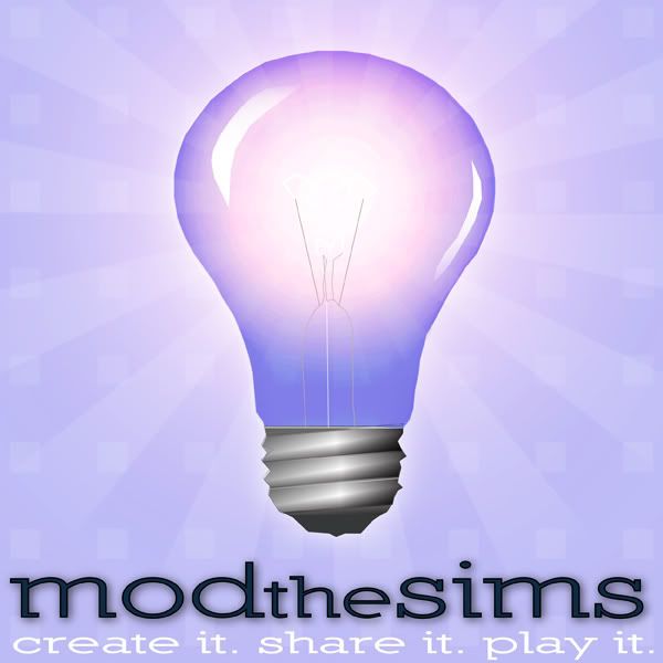
I have to agree with BlackOrchid. I tried fitting the mascot and bulb/gears together in some images last night, but they all look virtually unrecognizable at 60x60. Delphy, since you seem partial to BlackOrchid's lightbulb idea (which IS brilliant--no pun intended), I tried a simple version of my own in Illustrator. It looks good at 60x60, too, but I have a question--do you want the type included in the 60x60 icon?


16x16


60x60


135x36 (version 1)


135x36 (version 2)


600x600 (scaled down from 2500x2500)
Test Subject
#245 Old 27th Jan 2009 at 5:38 PM
i am so excited.. great job

Do something brave today, then run

Run Dude, Run!!!!
Lab Assistant
#246 Old 27th Jan 2009 at 6:11 PM
Yay MTS!

Hanging upside down to sleep does not make you cool or alternative - I know, because I've tried it...
Test Subject
#247 Old 27th Jan 2009 at 8:08 PM
perfect

*~ If I had a heart, this is where I would die of laughter.~*
Forum Resident
#248 Old 27th Jan 2009 at 10:43 PM
Personally, no disrespect to anyone else, I believe that blendy has the best idea. It's clean, pleasing to the eye, creative, and has, more than any others, the possibility of flexibility. Despite all this, everything else just wasn't working. So, since no one else did it, I did it myself. Included are new fonts, tag lines (minus ModtheSims), banners, icons, etc. So I present, by I'mSimalicious!:Blendy Homage 1. I hope you enjoy it. (Just a few notes : Because I tried to bring MST to modern times, I used modern fonts. The font being used is Redhead Goddess and can be found at http://www.1001freefonts.com/redheadgoddess.php. As you can see, our mascots have a little pet, companion if you will. While still nameless, its species is diamond, NOT plumbob . I had origionally tried to make some diamonds for a logo but it then I saw the competition . So when I started to edit blendy's work, I decided to bring in the diamond I created. Everything is saved as layered PSD's, with no rasterized text. Again, everything, other than the mascots, are created by me!

Mod the Sims:
http://farm4.static.flickr.com/3437...14fd54e.jpg?v=0
http://farm4.static.flickr.com/3320...425b26d.jpg?v=0

Sims Community:
http://farm4.static.flickr.com/3128...6e310c2.jpg?v=0
http://farm4.static.flickr.com/3427...41db769.jpg?v=0
http://farm4.static.flickr.com/3440...e3875da.jpg?v=0

Sims Wiki:
http://farm4.static.flickr.com/3459...09d5d30.jpg?v=0
http://farm4.static.flickr.com/3490...8499450.jpg?v=0

Sims Adult:
http://farm4.static.flickr.com/3381...7061d53.jpg?v=0
http://farm4.static.flickr.com/3458...f13461b.jpg?v=0

Icons:
http://farm4.static.flickr.com/3298...480b36d.jpg?v=0

I will add the other things later
Test Subject
#249 Old 27th Jan 2009 at 11:23 PM Last edited by yaaravanesse : 27th Jan 2009 at 11:28 PM.
Quote: Originally posted by Delphy
Interesting designs, yaar, but unfortunately you got the site names mostly wrong :P


Really? I went to the websites to get them...lol *scratches head* Good thing it's easily fixed. Haha!

Any suggestions on the art part of the designs?
Test Subject
#250 Old 27th Jan 2009 at 11:48 PM
Oh wow, so much changes. I was wondering why sims2community changed to sims-community. Thought the domain was somehow expired/bought from another person hah, turns out it redirects.

Cheers to the sims 3 hopefully lots of people will create sims 2 stuff as I don't see myself upgrading my computer to reach sims 3's standards.

Pandia
Page 10 of 17
Back to top