 Sign in to Mod The Sims
- Site Map >
- Modding and Creation >
- Creator Feedback Forum >
- Sims 2 >
- Lots and Housing - My Old Cottage
- Site Map >
- Modding and Creation >
- Creator Feedback Forum >
- Sims 2 >
- Lots and Housing - My Old Cottage
#1
 14th Dec 2012 at 9:14 PM
Last edited by x1chloe1c : 14th Dec 2012 at 9:33 PM.
14th Dec 2012 at 9:14 PM
Last edited by x1chloe1c : 14th Dec 2012 at 9:33 PM.
14th Dec 2012 at 9:14 PM
Last edited by x1chloe1c : 14th Dec 2012 at 9:33 PM.
Posts: 23
My Old Cottage
This is my first ever upload 
It's my house I designed over last weekend, and I thought it could be good enough to be uploaded onto this site. I've wanted to contribute to this site for ages, but I disn't know what to upload.
It's supposed to be a bungalow-cottage, but i didn't know what to call it in the title.

So here it is. I hope you guys like it! :D
EDIT:
I'm just wondering if my pics are big enough and good quality. They look ok when I open in picture viewer. I'm just not sure

Advertisement

#2
14th Dec 2012 at 9:44 PM
14th Dec 2012 at 9:44 PM
Good for you for having a go.
My advice would be to make the rooms smaller or make more rooms. Otherwise the overall design is nice.
The single bedroom and bathroom are huge. With the bathroom on the far right I think I am counting 5 by 4 squares? 3 by 3 is enough room for what you have in there. The single bedroom should be two bedrooms.
Outside under the tree you should put some flowers to add some colour.
"I dream of a better tomorrow, where chickens can cross the road and not be questioned about their motives." - Unknown
~Call me Jo~
#3
14th Dec 2012 at 11:08 PM
14th Dec 2012 at 11:08 PM
Posts: 167
Thanks: 1733 in 25 Posts
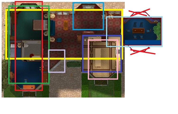
For picture information and the pictures required for upload:
MTS2:Creator Guidelines/Lots and Houses
Outside:
One of the required shots is a shot of the roof, so make one of those. From what I can see, it needs some work.
Start with a roof (from side to side) across the main part of the house, then start adding gables where needed. Make sure that you pull them back far enough that the roof ridges (the top ridges) are coming out of the main roof. Also, keep in mind not to go too far so they don't stick out the other side. Do the roof over the angled entrance last. If this sounds confusing, you're not alone, I had to draw it out (just drawn squares). If you want, I'll post it, just let me know.
Make sure shrubs are not sticking through the wall and that all of the shrubs and hedges are facing a direction they can be reached.
I don't particularly like hibiscus and the border around the tree being right on the edge of the lot. Consider a couple of shrubs and some flowers around the tree and move the hibiscus back a space.
Is there a gate in the fence at the back?
Inside:
Its an interesting floor plan, I agree, the rooms are too large, which makes them look empty, barely decorated. You have enough room you could add another bathroom between the two bedrooms.
Is there a back door?
Have you checked the house at night to see if there's enough light? I'm not sure if the sconces you have will light the rooms well.
Bathroom
The bathtub is facing the wrong way. Sims can't use it when the opening is against the wall.
Kitchen
Consider moving table & chairs away from the windows 1 tile, sims can get stuck between the two chairs and the wall. Would such formal table and chairs be in a kitchen?
Is there a smoke detector?
Livingroom
To me, the carpet and the wallpaper clash. It also looks like the piano is covering one of the windows, consider swapping places with the easels.
Bedroom
It looks like there's a glass door or arch way into the blue bedroom. If so, consider replacing with the same door as what is on the other bedroom.
Also, not sure about the pink flowery bed linen in all the blue.
Inspire. Dream. Hope. Believe. Imagine. Create.
#4
14th Dec 2012 at 11:15 PM
14th Dec 2012 at 11:15 PM
Posts: 453
Thanks: 188 in 2 Posts
I agree. I think the house is big enough for two bedrooms. Also, (and this is JMO) I think the bathroom should be closer to the bedroom. Realistically, first thing in the morning, no one wants to trek all the way to the other side of the house to use the toilet and brush teeth. You can put the office where the bathroom currently is, and turn the former office into a bathroom and something else...maybe a little reading area or formal sitting nook.
Also, The roof is kind of weird. I don't think the will accept a roof like that (I've had problems uploading because of the roof). Play around with it, but I would take out the middle peak or change it to one long horizontal piece.
As far as the decorating goes, I love it. It looks to be BG only which I think is awesome.
Edit: Also, is that carpet in the bathroom? I think that's kind of gross. I would suggest using tile/linoleum, at the very least in the areas around the toilet, tub, and sink.
#5
14th Dec 2012 at 11:39 PM
14th Dec 2012 at 11:39 PM
Posts: 4,228
Thanks: 10346 in 107 Posts
Looks like you have the makings of a nice house there 
I agree with the other posters above, some changes need to be made.
Looking forward to seeing some updates.
I agree with the other posters above, some changes need to be made.
Looking forward to seeing some updates.
#6
15th Dec 2012 at 12:30 PM
15th Dec 2012 at 12:30 PM
Posts: 23
Thank you for your feedback!
I'm now considering your suggestions, and thinking of a place that I can move my bathroom to; I'm thinking that it should go inbetween the two bedrooms, and the bathroom could become a dining room.
Hopefully I will post the screenshots of the updated house by tomorrow!
I'm now considering your suggestions, and thinking of a place that I can move my bathroom to; I'm thinking that it should go inbetween the two bedrooms, and the bathroom could become a dining room.
Hopefully I will post the screenshots of the updated house by tomorrow!
#7
15th Dec 2012 at 6:10 PM
15th Dec 2012 at 6:10 PM
I like the outside- good curb appeal. Maybe add a few flowerbeds around the front of the house?
The inside is very dark and huge. Maybe split it into a few rooms rather then having one huge big space. That also goes for the second bedroom- add a bathroom in some of the space and turn the bathroom into a bedroom or a office.
The inside is very dark and huge. Maybe split it into a few rooms rather then having one huge big space. That also goes for the second bedroom- add a bathroom in some of the space and turn the bathroom into a bedroom or a office.
#8
15th Dec 2012 at 8:01 PM
15th Dec 2012 at 8:01 PM
Posts: 23
Quote: Originally posted by JadedSidhe
|
Outside: One of the required shots is a shot of the roof, so make one of those. From what I can see, it needs some work. Start with a roof (from side to side) across the main part of the house, then start adding gables where needed. Make sure that you pull them back far enough that the roof ridges (the top ridges) are coming out of the main roof. Also, keep in mind not to go too far so they don't stick out the other side. Do the roof over the angled entrance last. If this sounds confusing, you're not alone, I had to draw it out (just drawn squares). If you want, I'll post it, just let me know. Make sure shrubs are not sticking through the wall and that all of the shrubs and hedges are facing a direction they can be reached. I don't particularly like hibiscus and the border around the tree being right on the edge of the lot. Consider a couple of shrubs and some flowers around the tree and move the hibiscus back a space. Is there a gate in the fence at the back? Inside: Its an interesting floor plan, I agree, the rooms are too large, which makes them look empty, barely decorated. You have enough room you could add another bathroom between the two bedrooms. Is there a back door? Have you checked the house at night to see if there's enough light? I'm not sure if the sconces you have will light the rooms well. Bathroom The bathtub is facing the wrong way. Sims can't use it when the opening is against the wall. Kitchen Consider moving table & chairs away from the windows 1 tile, sims can get stuck between the two chairs and the wall. Would such formal table and chairs be in a kitchen? Is there a smoke detector? Livingroom To me, the carpet and the wallpaper clash. It also looks like the piano is covering one of the windows, consider swapping places with the easels. Bedroom It looks like there's a glass door or arch way into the blue bedroom. If so, consider replacing with the same door as what is on the other bedroom. Also, not sure about the pink flowery bed linen in all the blue. |
I forgot about the smoke detector and the gate
 . But there is a back door next to the piano (which I'm going to move). I've made a bathroom inbetween the bedrooms, and the old bathroom will become the dining room.
 Thank you for your feedback! :D
#9
15th Dec 2012 at 10:12 PM
15th Dec 2012 at 10:12 PM
Posts: 23
Here is my updated house. I'm still not sure about the roof, but I think it looks better. I've used some of your feedback to improve the house.
I made a new bathroom in the space in the bedroom 2, and where the bathroom was, I made it into the dining room. In the kitchen, there is counters, where the table was. I have also added a fire alarm.
Outside, I added some lights and a fence, with a path leading up to it.
There are a few minor changes to the walls, the wallpaper and the flooring as well.
Hope it's at least a bit better than before.

#10
15th Dec 2012 at 11:40 PM
15th Dec 2012 at 11:40 PM
Posts: 167
Thanks: 1733 in 25 Posts
Its looking better.
Since the piece on the right side looks like a garage that was turned into a room, I'd suggest taking off the bay windows, widen the room 1-2 tiles and bring the whole room down 2 tiles. Then break up the counters in the kitchen and put in another archway. That way sims can go into the dining room from both the kitchen and the living room.
As for the roof, try a mix of different roof styles.
Try using Gabled Roofs on the Red, Blue, Light Blue, Yellow and Hipped Roofs for the rest.
Note: Looking at it again, where the light and dark purples are, you could drag 1 roof across the sidewalk.
Inspire. Dream. Hope. Believe. Imagine. Create.
#11
15th Dec 2012 at 11:51 PM
15th Dec 2012 at 11:51 PM
Posts: 23
That seems a great idea!
The way that you showed how the roofs should go seems much better than what I did, and adding an archway in the kitchen would be a good idea as well.
Thanks!
The way that you showed how the roofs should go seems much better than what I did, and adding an archway in the kitchen would be a good idea as well.
Thanks!
#12
16th Dec 2012 at 12:20 AM
16th Dec 2012 at 12:20 AM
Could you get closer in on your overhead, my poor old eyes can hardly see the details.  Just the house, no road or yard. Also one of the front, to see how the roof looks from a sims eye view point, not just the top down. Also we don't need those inside, side on pictures, rather close up overheads of each room. Floor plan style rather then the pretty decorating.
 Just the house, no road or yard. Also one of the front, to see how the roof looks from a sims eye view point, not just the top down. Also we don't need those inside, side on pictures, rather close up overheads of each room. Floor plan style rather then the pretty decorating.
 "I dream of a better tomorrow, where chickens can cross the road and not be questioned about their motives." - Unknown
~Call me Jo~
#13
16th Dec 2012 at 1:52 AM
16th Dec 2012 at 1:52 AM
Posts: 453
Thanks: 188 in 2 Posts
I would just completely take off the dining room and put in a driveway extension piece instead. Wall off the area with the piano and easels and convert it into the dining room by reducing the kitchen size by one or two rows of tiles (and changing the island to be horizontal). Move the bay window over one tile so it will be symmetric with the other bay window location. This would also make the red room smaller and less empty looking. IDK, what do you guys think?
Edit: Ahh I forget this is BG so there is no driveway. I've been so long with it that I just ASSumed that your driveway was the invisible driveway.
Edit: Ahh I forget this is BG so there is no driveway. I've been so long with it that I just ASSumed that your driveway was the invisible driveway.
#14
16th Dec 2012 at 12:53 PM
16th Dec 2012 at 12:53 PM
Posts: 23
Quote: Originally posted by joandsarah77
|
Could you get closer in on your overhead, my poor old eyes can hardly see the details. Just the house, no road or yard. Also one of the front, to see how the roof looks from a sims eye view point, not just the top down. Also we don't need those inside, side on pictures, rather close up overheads of each room. Floor plan style rather then the pretty decorating. |
I will do. Hopefully it would be uploaded tonight. :D
#15
16th Dec 2012 at 6:56 PM
16th Dec 2012 at 6:56 PM
Posts: 23
Quote: Originally posted by ttowntallyho
|
I would just completely take off the dining room and put in a driveway extension piece instead. Wall off the area with the piano and easels and convert it into the dining room by reducing the kitchen size by one or two rows of tiles (and changing the island to be horizontal). Move the bay window over one tile so it will be symmetric with the other bay window location. This would also make the red room smaller and less empty looking. IDK, what do you guys think? Edit: Ahh I forget this is BG so there is no driveway. I've been so long with it that I just ASSumed that your driveway was the invisible driveway.
|
It was supposed tbe a driveway, but it wouldn't fit!
So when I first played it, I just used moveobjects and put an extension piece where the driveway should be, but when I played the lot, the car wouldn't go on the road, it just dissapeared, and the loading screen would appear (It looked strange, so there is no driveway at all.)
Does anyone have ideas on what can go there in that space? I don't know what to put there

#16
16th Dec 2012 at 8:19 PM
16th Dec 2012 at 8:19 PM
When you say extension piece do you mean the driveway (the piece the you put down first) or do you mean the actual extension piece that makes a driveway longer? If it was the part that makes it longer then there would be your trouble. Just try a driveway with move objects. A little clipping with the house doesn't matter if you use the invisible recolour.
"I dream of a better tomorrow, where chickens can cross the road and not be questioned about their motives." - Unknown
~Call me Jo~
#17
16th Dec 2012 at 8:24 PM
16th Dec 2012 at 8:24 PM
Posts: 4,228
Thanks: 10346 in 107 Posts
you could use the lotadjuster and add some tiles to the front and back of the lot?
#18
16th Dec 2012 at 8:35 PM
16th Dec 2012 at 8:35 PM
Posts: 23
Quote: Originally posted by joandsarah77
| When you say extension piece do you mean the driveway (the piece the you put down first) or do you mean the actual extension piece that makes a driveway longer? If it was the part that makes it longer then there would be your trouble. Just try a driveway with move objects. A little clipping with the house doesn't matter if you use the invisible recolour. |
It worked ok using the driveway extension piece, but I think that people would think it would be a bit strange having a car that disappears instead of leaving the lot normally. When I tried Putting the proper driveway down using moveobjects, it wouldn't be there after clicking on the designated spot where I wanted it to be. Does anybody know what's wrong and anyway to sort it out?
#19
16th Dec 2012 at 9:10 PM
16th Dec 2012 at 9:10 PM
It wouldn't be there? You mean you can't grab it from the catalogue? That usually indicates another piece of cc is interfering. Not sure of the correct terminology, but I had a cc table that did that to the Maxis glass table. The cc table could be placed but nothing was there when I tried to place the glass maxis table. It’s so annoying when people put up borked cc.
"I dream of a better tomorrow, where chickens can cross the road and not be questioned about their motives." - Unknown
~Call me Jo~
#20
16th Dec 2012 at 9:20 PM
16th Dec 2012 at 9:20 PM
Posts: 23
Quote: Originally posted by joandsarah77
| It wouldn't be there? You mean you can't grab it from the catalogue? That usually indicates another piece of cc is interfering. Not sure of the correct terminology, but I had a cc table that did that to the Maxis glass table. The cc table could be placed but nothing was there when I tried to place the glass maxis table. It’s so annoying when people put up borked cc. |
When I put a driveway down without the moveobjects cheat enabled, it works ok. It's just when moveobjects is enabled I have the problem
#21
16th Dec 2012 at 9:34 PM
16th Dec 2012 at 9:34 PM
Posts: 23
Hopefully it's better :D
#22
16th Dec 2012 at 10:08 PM
16th Dec 2012 at 10:08 PM
I like that and thanks for the larger picture. The roof and the floor plan looks good. I think you can move onto the garden now.
There shouldn't be any trouble placing a driveway piece with moveobjects, you have something going on there.
There shouldn't be any trouble placing a driveway piece with moveobjects, you have something going on there.
"I dream of a better tomorrow, where chickens can cross the road and not be questioned about their motives." - Unknown
~Call me Jo~
#23
16th Dec 2012 at 10:24 PM
16th Dec 2012 at 10:24 PM
Posts: 167
Thanks: 1733 in 25 Posts
I'd bring the little roof over the angled entrance further to the left, so the pitch of the roof lines up with the left roof.
Inspire. Dream. Hope. Believe. Imagine. Create.
Inspire. Dream. Hope. Believe. Imagine. Create.
#24
16th Dec 2012 at 11:55 PM
16th Dec 2012 at 11:55 PM
Posts: 1,094
Thanks: 1496 in 15 Posts
This is making really good progress, I like it! And I agree with Jaded, the roof over the entry looks odd like that (I think) I think it you dragged it further left it might look better, if it isnt too tall.
#25
17th Dec 2012 at 12:19 AM
17th Dec 2012 at 12:19 AM
That's a good idea so long as it doesn't cut the window.
"I dream of a better tomorrow, where chickens can cross the road and not be questioned about their motives." - Unknown
~Call me Jo~
| Locked thread | Locked by: spladoum Reason: good home-creation tips. | |
Who Posted
|
|