Hi there! You are currently browsing as a guest. Why not create an account? Then you get less ads, can thank creators, post feedback, keep a list of your favourites, and more!
Quick Reply
Search this Thread
Lab Assistant
Original Poster
#1 Old 31st Dec 2006 at 6:23 PM
Default *Interior designer needed*
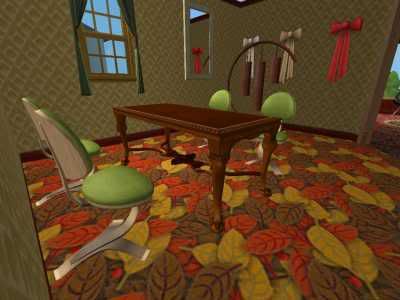
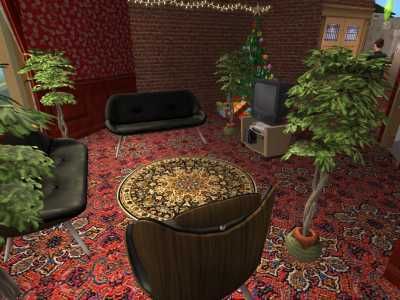
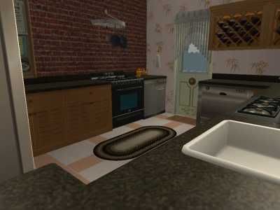
Would somebody please take a look at my rooms and tell me what's wrong...


Thankyou

*´")
..·´¸.·*´¨) ¸.·*¨)
(¸.·´ (¸.·´Wil-Redfern*¨)¸;*
Advertisement
Field Researcher
#2 Old 31st Dec 2006 at 6:27 PM
Not sure, but I would suggest downloading some new non-maxis stuff. You might want to ask this over on the Room pictures thread, or PM one of those great people. Because I am not exactly the best myself. But I would suggest to stick with one style,(And no, I do not mean maxis collections, unless you have too.) But stick wih one style, preferable through out the house, such as oriental, modern, ect....

potterhead
call me bria
Moderator of Extreme Limericks
#3 Old 31st Dec 2006 at 6:41 PM
Mm... I think the problem might be that your decorating style is just too busy. There are too many colors and details that look fine on their own, but just don't match when they're placed together. An eclectic look is nice, but you have to make sure that the things that you're using match a little better. Let's take the first room, for instance. The table and the wallpaper work nicely together, but the chairs are a completely different color wood, and don't match at all. Also, while the room is mostly made up of subdued tans and browns, the carpet is an explosion of oranges and yellows that just don't go with the feel of the room.

The same is true for the second room... the classic carpet pattern, urban-feeling brick wall, country wallpaper, and retro sofa set just don't cooperate well. Go for a nice solid colored floor, maybe a berber rug or something, and then make the walls match each other. Accent walls are nice, but only when they tie things together. Also, all of the potted plants are monotonous... try mixing things up with a lamp or an end table.

I'm not going to go into the kitchen, because it's pretty much the same situation as the other two rooms. All you really need to do is find things that match each other color and texture-wise. You're bold and like to experiment, which is good... but just make sure that you have something that ties all of the eclectic decorations together.

And I think negneg might be right... I don't think this is the right forum.

There's always money in the banana stand.
Field Researcher
#4 Old 31st Dec 2006 at 7:02 PM
You can make some really nice rooms with only Maxis content, if you don't want to use CC.

I agree with jhd on the rest though.

Everyone is entitled to be stupid, but some abuse the privilege.
________________________________
Lab Assistant
Original Poster
#5 Old 31st Dec 2006 at 7:10 PM
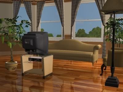
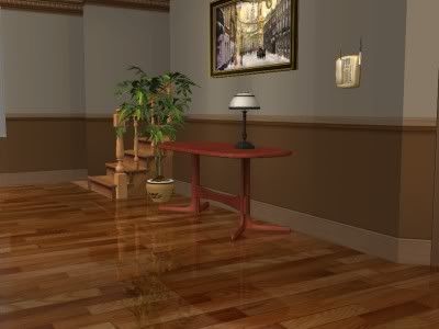
Wow thankyou everyone. Since reading this post, I have make a living room (Which was very hard for me because I used simple colours), and here is how it turned out;

*´")
..·´¸.·*´¨) ¸.·*¨)
(¸.·´ (¸.·´Wil-Redfern*¨)¸;*
Moderator of Extreme Limericks
#6 Old 31st Dec 2006 at 7:46 PM
That looks wonderful!! And yes, I agree, you can make some really nice looking rooms using only Maxis-made content. It's just more of a challenge.

There's always money in the banana stand.
Lab Assistant
Original Poster
#7 Old 31st Dec 2006 at 8:04 PM
Yay thankyou. I'm glad people like the "new" me. It took lots of time to put down only 6 pieces of furniture. I usually go wild and put down anything. Also my houses usually end up cluttered after I have put down everything my Sims need. That living room is the most spacious room I have ever built.

The only problem is that when I make rooms like this my house looks like one of those show-homes.

*´")
..·´¸.·*´¨) ¸.·*¨)
(¸.·´ (¸.·´Wil-Redfern*¨)¸;*
Test Subject
#8 Old 31st Dec 2006 at 8:11 PM
That looks way better. I think the main problem that it was just too dark!

Heres a llama theres a llama and another little llama fuzzy llama funny llama llama llama DUCK!

Jessica Walden is sharing my account, because for some reason MTS2 won't let her. Not sure why or how... but now you know anyway.
Lab Assistant
Original Poster
#9 Old 31st Dec 2006 at 8:12 PM
Thankyou MentalMetalPetals I think the old designs were a bit dark. If only I could create a room which was useable but also spacious! And sorry for all these questions being fired at everyone...

*´")
..·´¸.·*´¨) ¸.·*¨)
(¸.·´ (¸.·´Wil-Redfern*¨)¸;*
#10 Old 31st Dec 2006 at 8:26 PM
No, don't feel bad about asking anything! That's how you learn! Taking the expertise or at least knowledge of other people who have it to help you, that's what we're all here to do. You do very well with direction too, I must add. The new look is simple, classic and above all--looks great! :D
Lab Assistant
Original Poster
#11 Old 31st Dec 2006 at 10:07 PM
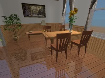
This is another simple room I have built. Now I have built a couple of rooms of this sort, I am becoming more confident and adding pictures, plants, telephones and other little items of the sort.

*´")
..·´¸.·*´¨) ¸.·*¨)
(¸.·´ (¸.·´Wil-Redfern*¨)¸;*
Forum Resident
#12 Old 31st Dec 2006 at 10:21 PM
The occasional item of clutter, some glasses and a wine bottle? on the table will make it look more lived in...
Pic in post 11 - looks a bit stark, warm in up by perhaps adding a rug. But certainly an improvement on your earlier pics.

I've never been married, but I tell people I'm divorced so they won't think something is wrong with me.
- Anonymous


Sideways Garage Tutorial
Lab Assistant
#13 Old 1st Jan 2007 at 1:18 AM
Well, I must say. You improved a huge amount. That last dining room is lovely, and I wouldnt mind popping into the computer right now to eat some virtual baked alaska.

Luckily for you (and the baked alaska) that is not possible, so you will not have crazy people running loose in your game.

:D

Also, if you feel like it is too show-home-y, use cheats to make it look a bit more... Cluttered.

-Goes to find example, using maxis content-


Picture by Miss Puff.

See what I mean, jelly bean?
Field Researcher
#14 Old 1st Jan 2007 at 1:22 AM
gethane makes some really nice Maxis-only houses, you could get some inspiration from his lots:

http://prismbaby.com/sims/house_sea.../seabreeze.html

Everyone is entitled to be stupid, but some abuse the privilege.
________________________________
Test Subject
#15 Old 1st Jan 2007 at 3:03 AM
Madisim at TSR also is a good designer. Also check out the people at Parsimonious.
Lab Assistant
Original Poster
#16 Old 1st Jan 2007 at 12:19 PM
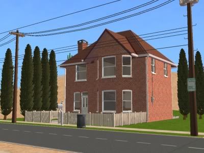
Oh thanks for all your advice! GreenStraws that is a great room! Fresh but not too sparse! Yay!! Thankyou everyone again! I forgot to post some pictures of my old exterior houses, but here is a recent one using the design techniques;

*´")
..·´¸.·*´¨) ¸.·*¨)
(¸.·´ (¸.·´Wil-Redfern*¨)¸;*
#17 Old 1st Jan 2007 at 12:25 PM
That house looks very realistic The fence goes with the windows too

Also, in the dining room pic, maybe adding mirror floors there wasn't too good an idea. It looks nice and all, but I tend to feel if you want the house to feel more homey, don't use mirror floors. And only use them when the room is modern
#18 Old 1st Jan 2007 at 12:41 PM
1st Pic- I think the chairs should be a darker green, or a green/brown. They are too vibrant in comparison to the darker colours on the wall and floors. Probably should be wooden too.

2nd Pic- Nice room, but if anythign could be changed i would get rid of one or two of the trees, or replace them with smalled ones. They take over the room.

3rd Pic- The flooring infront of the counters doesnt seem right, maybe replace it with a floor that is symetrical; this one looks like it needs to be carried on more. And also a new rug, i would recommend a rectangular one in the kitchen as the counter and appliances are squared.

4th Pic- It looks good, except the curtains dont match?

5th Pic- Hmm, to me it doesnt look quite right, i think it is because if looks like the desk was put there and the tree is just to fill the gap. Try replacing the lamp with a wall light nearby and them putting a small plant on the desk instead of the tree next to it.

6th Pic- Again the lamp, put a large standing light next to the little table instead, this opens up the desk space. Which looks better and is practical for you sims

7th Pic- Love the look, very realistic. Even the little gutters! :P


nice house :D
Lab Assistant
Original Poster
#19 Old 1st Jan 2007 at 12:42 PM
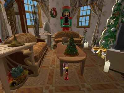
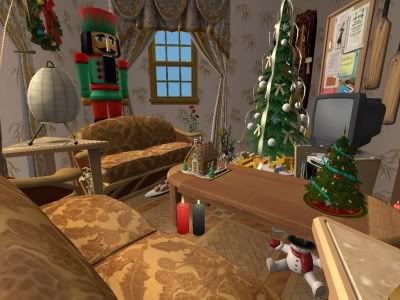
GreenStraw I tried your tips and used some cheats and it turned out quite well;


I kind of like it...

*´")
..·´¸.·*´¨) ¸.·*¨)
(¸.·´ (¸.·´Wil-Redfern*¨)¸;*
Lab Assistant
Original Poster
#20 Old 1st Jan 2007 at 12:46 PM
And thankyou, SwiftSign and Melanie! Your help is greatly appreciated!

*´")
..·´¸.·*´¨) ¸.·*¨)
(¸.·´ (¸.·´Wil-Redfern*¨)¸;*
#21 Old 1st Jan 2007 at 12:52 PM
awww that's so cute! It looks really cozy!
Instructor
#22 Old 1st Jan 2007 at 6:15 PM
You've made a great improvement! Good job! The last pic reminded me of a couple in an apartment, curling up by the television with some cups of hot cocao. Lovely job on the other rooms and house, shows great mastery over the art!

Ciao,
~M~
Moderator of Extreme Limericks
#23 Old 2nd Jan 2007 at 12:50 AM
Oh wow! That brick house you made is so REAL looking! The little electric box on the side of the house is a nice touch. :D

There's always money in the banana stand.
Instructor
#24 Old 2nd Jan 2007 at 5:44 PM
Wow, you have improved. I don't know what anyone else thought... but I think in your second picture... it was a little overrun by plants! You're making definate improvement from what I can see, and the exterior shot looks lovely!

Yeah... alright, you can PM me to request a house I suppose... Might take a while though as forewarning...
#25 Old 9th Jan 2007 at 3:11 PM
How do you make your wood floors "shiny" like that? More reflective? I keep seeing it in in-game screenshots and wanting to do it in my houses.
Page 1 of 2
Back to top