
 Sign in to Mod The Sims
- Site Map >
- Community >
- Sims Discussion >
- Sims 2 >
- Sims 2 Contests >
- Closed Contests >
- Application - Urban Conversion Contest
- Site Map >
- Community >
- Sims Discussion >
- Sims 2 >
- Sims 2 Contests >
- Closed Contests >
- Application - Urban Conversion Contest
#876
 17th Feb 2017 at 11:05 AM
17th Feb 2017 at 11:05 AM
Posts: 8,859
Thanks: 3118 in 87 Posts
Super job, Cat!
I also really enjoyed the contest, and, boy, did I learn a lot! To think that, before this contest, I really did not know anything about Painted Ladies and very little about Gothic Revival! Thank you, Phaenoh, it was a wonderful idea.
So, fellow contestants, let's go drinking See you at the fermented fruit juice bar!
Windows 10 and the Ultimate Collection
http://modthesims.info/showthread.php?t=568275
http://modthesims.info/showthread.php?t=614833
I also really enjoyed the contest, and, boy, did I learn a lot! To think that, before this contest, I really did not know anything about Painted Ladies and very little about Gothic Revival! Thank you, Phaenoh, it was a wonderful idea.
So, fellow contestants, let's go drinking
 See you at the fermented fruit juice bar!
Windows 10 and the Ultimate Collection
http://modthesims.info/showthread.php?t=568275
http://modthesims.info/showthread.php?t=614833
Advertisement

#877
18th Feb 2017 at 8:26 PM
18th Feb 2017 at 8:26 PM
Can the Renos be judged yet? who is missing?
Uh oh! My social bar is low - that's why I posted today.
My SIMBLER | SIM WHIM | SIM VIDS | SIMS 2 STORIES | SIM PICTURE-TAKING TIPS | MY HOOD | SIMSTAGRAM | TWITTER | TWITCH
#878
18th Feb 2017 at 10:45 PM
18th Feb 2017 at 10:45 PM
Quote: Originally posted by Charmful
| Can the Renos be judged yet? who is missing? |
I feel like there was only four of us left in this round, so if all four renos are posted, I would be inclined to say that judging might be able to get underway?
#879
19th Feb 2017 at 4:24 PM
19th Feb 2017 at 4:24 PM
Yeah, it can. I'm just falling behind on everything so I haven't had a chance to update the spreadsheets for the judges to make it easy for them.
#880
19th Feb 2017 at 10:16 PM
19th Feb 2017 at 10:16 PM
Quote: Originally posted by Phaenoh
| Yeah, it can. I'm just falling behind on everything so I haven't had a chance to update the spreadsheets for the judges to make it easy for them. |
Join the club.
*hands Phae a "Falling Behind On LIFE!" button.*
#881
20th Feb 2017 at 1:49 AM
Last edited by Phaenoh : 20th Feb 2017 at 2:12 AM.
20th Feb 2017 at 1:49 AM
Last edited by Phaenoh : 20th Feb 2017 at 2:12 AM.
Yup, www.facebook.com/Phaenoh/posts/10103904254494705. I'll try to do it here right now though.
Edit: Ok judges, the score sheets are linked to the entries. @caitawesome I still need your scores for the library reno. @joandsarah77 and @Charmful the apartments are ready for you. Notes go in Column P. (It might look like words from O are in the way, but just start typing.)
Edit: Ok judges, the score sheets are linked to the entries. @caitawesome I still need your scores for the library reno. @joandsarah77 and @Charmful the apartments are ready for you. Notes go in Column P. (It might look like words from O are in the way, but just start typing.)
#882
21st Feb 2017 at 7:19 AM
21st Feb 2017 at 7:19 AM
Phae, I did not get a pm hail. *shrug* I just checked the thread as I saw it had been posted to.
"I dream of a better tomorrow, where chickens can cross the road and not be questioned about their motives." - Unknown
~Call me Jo~
#883
22nd Feb 2017 at 2:18 AM
22nd Feb 2017 at 2:18 AM
Maybe because I added them in during my edit? Doesn't matter, any sort of urgency has gone RIGHT out the window with this contest. It was scheduled to be over in early Dec. *shrug*
#884
22nd Feb 2017 at 7:09 AM
Last edited by joandsarah77 : 22nd Feb 2017 at 12:39 PM.
22nd Feb 2017 at 7:09 AM
Last edited by joandsarah77 : 22nd Feb 2017 at 12:39 PM.
Yes, it's been five months... 
All finished.

All finished.
"I dream of a better tomorrow, where chickens can cross the road and not be questioned about their motives." - Unknown
~Call me Jo~
#885
23rd Feb 2017 at 6:17 AM
23rd Feb 2017 at 6:17 AM
Me too (finished judging)! It's been a joy to look at everyone's entries and see how they renovate their shells <3
Uh oh! My social bar is low - that's why I posted today.
My SIMBLER | SIM WHIM | SIM VIDS | SIMS 2 STORIES | SIM PICTURE-TAKING TIPS | MY HOOD | SIMSTAGRAM | TWITTER | TWITCH
#886
23rd Feb 2017 at 7:14 AM
Last edited by joandsarah77 : 3rd Mar 2017 at 9:27 AM.
23rd Feb 2017 at 7:14 AM
Last edited by joandsarah77 : 3rd Mar 2017 at 9:27 AM.
Yes, I've seen some people come a long way in building over this contest.
@Phaenoh Can we wrap this up yet or are we waiting on something?
@Phaenoh Can we wrap this up yet or are we waiting on something?
"I dream of a better tomorrow, where chickens can cross the road and not be questioned about their motives." - Unknown
~Call me Jo~
#887
6th Mar 2017 at 6:48 PM
6th Mar 2017 at 6:48 PM
I was wait on our third judge, but it doesn't look like she's gonna come through. I'll just go ahead and post the scores with just two, and wrap this thing up. Thank you everyone for your patience and participation!
#888
6th Mar 2017 at 8:41 PM
6th Mar 2017 at 8:41 PM
Posts: 8,859
Thanks: 3118 in 87 Posts
Thank you, Phaenoh. Before we reach the final, final, final final of this competition, I'd like to congratulate the last four standing (including myself ) here. I think we can give ourselves a little applause for reaching the enc. Thank you, you were hard to compete with and I love you all In the end, we are all winners and I am getting the champagne ready at the fermented juice bar so that we can toast each other and the winner
Windows 10 and the Ultimate Collection
http://modthesims.info/showthread.php?t=568275
http://modthesims.info/showthread.php?t=614833
) here. I think we can give ourselves a little applause for reaching the enc. Thank you, you were hard to compete with and I love you all In the end, we are all winners and I am getting the champagne ready at the fermented juice bar so that we can toast each other and the winner
Windows 10 and the Ultimate Collection
http://modthesims.info/showthread.php?t=568275
http://modthesims.info/showthread.php?t=614833
#889
9th Mar 2017 at 11:25 PM
9th Mar 2017 at 11:25 PM
And The Winner Is.....
Our Winner is CatherineTCJD with 132 points! Second place goes to ForeverCamp with 128, and JustPetro was so close at third with 126. Porkypine has earned 4th place with 117. Congrats to all and thank you for sticking with me through this much longer and bumpier than intended journey!Following this will be posts of all the judges comments for the 4 of you.
*does happy dance*
#890
9th Mar 2017 at 11:25 PM
9th Mar 2017 at 11:25 PM
Run-down Church:
Cat - Lovely work on the decayed look both interior and exterior including old remnants of the past. I think my favorite dilapidated room is the Pastor's office. Love this peeling wallpaper you deicided to use and the stone/wood basement walls. Great attention to detail overall! The Bell Tower seems a bit narrow but everything else seems spacially appropraite. In addition, I enjoyed reading your notes on the photo tour. A job very well done!
Such a cute church. I really appreciate the clear labelling.
Renovated Retail:
This Reno turned out really nice! The main floor is a great open space for browsing, and I love all the little details in the staff area/breakroom. For the most part I can see it flowing well - my only reservation would be changing rooms on the upper floor. If I have a bunch of clothes I want to try on - probably going to have some grumbles while I carry them all upstaires. Though aestetically, the changing area is great! love the nook with mirrors!
I really like your reno Cat. Great use of your blue colour theme, it feels like a nice combination between the old and the new. Some of those bags and shoes would have been nice to see on those empty stock room shelves. My only reservations outside would be that the playground looks right onto some graves and the blue door seems a little jarring in comparison to the rest of the exterior.
Run-down Warehouse:
First Impression: I like the layout, of the R&D office, Boss office, Office Manager and Reception area that flows into Foreman office and then to the Warehouse break room. I'm not a fan of the the floor-to-ceiling wooden panels that act as cubicals though, perhaps different fencing type or even half walls would have executed that plan better. Warehouse area is fabulous, love all the steel balconies. All your little interior details and dilapidated decorating are fantastic such as the telephone with the receiver off the hook! You really have all the best peeling wallpapers too.
Love the ghost-host! Great decorating.
Run-down Victorian:
Your shell is most impressive! All the rooms and nooks and crannies! I love how you split your tours and your peeling wallpaper and attention to dilapidated detailing always gets to me (in a good way)
Renovated Library:
This is a slam dunk of a Reno!! WOW! It has all requirements and you also went above and beyond revamping this dusty old mansion into a charming and quaint little library! I love your kids tracks for them to have fun following the path to their designated kids spot on the top floor. I think the entrace is very lovely, especially the reception and you laid out the break room and staff area very nicely. Very lovely details and thought put into this library!
I love your library Cat. The kid tracks are cute. Now where is my pie?
Run-down School:
I think your shell has the most interesting shapes - interior and exterior. Nice use of that knight statue! Again you have some of the best dilapidation deco showcased in here (it was too bad you couldn't finish the other two foors). I love the gym. It's so creepy looking. I love the art room too and how its unceremoniously covered in paint stains. Overall a really great job!
Renovated Apartments:
What you have done to renovate is amazing. It's almost unrecognizable as an old school on the inside. I love all the thought you've put into it as well as your touring photos. I like that the lease office looks a bit like a bank with the glass window half-walls. I think your apartment units have the best balance of space out of all entries, it's not easy to fill spaces but it looks natural and effortless in this building. I like how you managed some porches and exterior areas for some of the units too. It's all very organized and seems easy for a sim to navigate. The exterior has a nice enough update with the flowers, new playground equipment, and de-weeding but I think you could have pushed it more: pulled up the dead tree or added a small common grill out area for those Saturdays where the landlord gets everyone together. Despite that last notation, you have showed excellent attention to detail both on shells and renos and strong building skills. It was a pleasure to look at your creations and creativity!
Cat, the inside is amazing. I love your floor plans and decorating. I was a little disappointed with outside. I think it could have done with a little more landscaping. Perhaps some more flowers on the end of that zigzag path or at the front, and a nicer tree on the side.
Cat - Lovely work on the decayed look both interior and exterior including old remnants of the past. I think my favorite dilapidated room is the Pastor's office. Love this peeling wallpaper you deicided to use and the stone/wood basement walls. Great attention to detail overall! The Bell Tower seems a bit narrow but everything else seems spacially appropraite. In addition, I enjoyed reading your notes on the photo tour. A job very well done!
Such a cute church. I really appreciate the clear labelling.
Renovated Retail:
This Reno turned out really nice! The main floor is a great open space for browsing, and I love all the little details in the staff area/breakroom. For the most part I can see it flowing well - my only reservation would be changing rooms on the upper floor. If I have a bunch of clothes I want to try on - probably going to have some grumbles while I carry them all upstaires. Though aestetically, the changing area is great! love the nook with mirrors!
I really like your reno Cat. Great use of your blue colour theme, it feels like a nice combination between the old and the new. Some of those bags and shoes would have been nice to see on those empty stock room shelves. My only reservations outside would be that the playground looks right onto some graves and the blue door seems a little jarring in comparison to the rest of the exterior.
Run-down Warehouse:
First Impression: I like the layout, of the R&D office, Boss office, Office Manager and Reception area that flows into Foreman office and then to the Warehouse break room. I'm not a fan of the the floor-to-ceiling wooden panels that act as cubicals though, perhaps different fencing type or even half walls would have executed that plan better. Warehouse area is fabulous, love all the steel balconies. All your little interior details and dilapidated decorating are fantastic such as the telephone with the receiver off the hook! You really have all the best peeling wallpapers too.
Love the ghost-host! Great decorating.
Run-down Victorian:
Your shell is most impressive! All the rooms and nooks and crannies! I love how you split your tours and your peeling wallpaper and attention to dilapidated detailing always gets to me (in a good way)
Renovated Library:
This is a slam dunk of a Reno!! WOW! It has all requirements and you also went above and beyond revamping this dusty old mansion into a charming and quaint little library! I love your kids tracks for them to have fun following the path to their designated kids spot on the top floor. I think the entrace is very lovely, especially the reception and you laid out the break room and staff area very nicely. Very lovely details and thought put into this library!
I love your library Cat.
The kid tracks are cute. Now where is my pie?Run-down School:
I think your shell has the most interesting shapes - interior and exterior. Nice use of that knight statue! Again you have some of the best dilapidation deco showcased in here (it was too bad you couldn't finish the other two foors). I love the gym. It's so creepy looking. I love the art room too and how its unceremoniously covered in paint stains. Overall a really great job!
Renovated Apartments:
What you have done to renovate is amazing. It's almost unrecognizable as an old school on the inside. I love all the thought you've put into it as well as your touring photos. I like that the lease office looks a bit like a bank with the glass window half-walls. I think your apartment units have the best balance of space out of all entries, it's not easy to fill spaces but it looks natural and effortless in this building. I like how you managed some porches and exterior areas for some of the units too. It's all very organized and seems easy for a sim to navigate. The exterior has a nice enough update with the flowers, new playground equipment, and de-weeding but I think you could have pushed it more: pulled up the dead tree or added a small common grill out area for those Saturdays where the landlord gets everyone together. Despite that last notation, you have showed excellent attention to detail both on shells and renos and strong building skills. It was a pleasure to look at your creations and creativity!
Cat, the inside is amazing. I love your floor plans and decorating. I was a little disappointed with outside. I think it could have done with a little more landscaping. Perhaps some more flowers on the end of that zigzag path or at the front, and a nicer tree on the side.
#891
9th Mar 2017 at 11:25 PM
9th Mar 2017 at 11:25 PM
Run-down Church:
I enjoy the facade of this church but I think I like the interior more. The sanctuary is gorgeous and love those ceilings. While nothing exploded here, it's definitely worn with time and looks like some hooligans have broken in and made it their home base. I can clearly tell where every required room is without labels so very good job on that! My only critique is please pay attention to your other ceilings! I doubt the church had the default 'popcorn' ceilings - those were not prevalent until the 1950's through the 80's and you mentioned your church was vacated in the decade before so there would have been no chance those ceilings would have been there even in a remodel before the vacancy.
Renovated Retail:
I like this reno very much! I especially like how everything that the public doesn't need to see is in the basement. The dressing rooms in that elevated corner on the main floor are neat. I love that you considered putting secondary check-out and dressing rooms on the upper floor for the bargain loft section so sims don't have to trudge all the way back downstairs to check out. Also, nice call on having a massage parlor and beauty salon connected to the store too. A good theme of 'beauty and relaxation' enhancements on a store meant for aesthetics.
ForeverCamp I hardly recognize the place, great job. Even though the walls are modern I like how it looks with the old lead light windows. I think the employees would find store room 3 rather a long way to trek. I like dressing room one with the carpet and rug, it would have been nice to have used the same carpet in dressing room two.
Run-down Warehouse:
I like the squatter paradise feel going on here and the view upward into the high ceilings is breathtaking with all those balconies. I feel like this building could have benefited from a row of smaller windows across the top front of the factory where in real life that space was used for venting. Something about the external detailing doesn't jive, either the brick trimmed windows srrounded by cement/stone walls or the mixed rooflines. I think your interior and attention to details is your strongest point and so far is your greatest strength in this competition - from what I see of the other area of the warehouse, the reception is quite dilapidated and you used a good ceiling choice for the room. My only other critique is that I wished to see more shots of your other interiors, for example the stockroom, offices, or breakroom because there's already three dedicated to the main area.
Love the graffiti and inside cranes.
I could not see the manager's office. There is an office marked on the second level, but it seemed too small to be the manager's.
Run-down Victorian:
The exterior is most spooky and yet charming. I like the layout a lot and how you added all required rooms and then put little hints of them being lived in at one point. While maybe not a 'homeless person died here' kind of ruin, it definitely will need a good scrubbing.
Renovated Library:
First off, I love your reading nooks! I think those are a fantastic and unique addition to the reno. It's interesting you chose to revamp the entire top floor to a staff floor, I like it even if I didn't expect it. You have a lot of lovely extra features but you are missing a conference room which was a requirement. My advice would have been to re-purpose one of your stacks rooms into a conference room with multiple chairs and a podium or a long table with many chairs and some plant deco to get that requirement in. Otherwise the outside looks nice and spruced up, all the dead stuff is cleared away and it looks like a nice and cozy little library to spend a day in.
Forevercamp, what a lovely cozy library. A good place to curl up with a book.
Run-down School:
I really like this shell and how you have decorated for the abandoned/old feeling from dingy wooden ceilings to open cracks in the walls. The skewed desks and other furniature also attributes to the feel of abandonment these shells are supposed to invoke. Also great job with the exterior's graffiti, traffic cones, and dead vines. While you have all required rooms (+more!) I also advise you to be dilligent reading requirements because Phae asked for the classrooms to be on the second and third floors and the offices to be on the first and I see you have mixed it up a bit.
Renovated Apartments:
I'm kind of split on this complex because when I went through the bird eye views I felt 'meh' but then when I got into the interiors I felt a lot of excitement at the decoration - I guess I can't get that from the bird eye view but I have to say I REALLY LOVE YOUR INTERIOR PICS. Without them, I wouldn't know the clever use of the window as a shower partition in the apartment unit or understand just how lovely and multi-shelved those unit kithcen are!! They just add so much depth and they really boosted your decorated and alive again score. My only critique, and it didn'tdock you any points and I can see why you didn't do it but you are missing beds in the extra bedrooms. I can understand if a renter would want to do something else with those bedrooms but they are just kind of left blank while everything else is decorated and it seemed odd. I think you did a very great job in this competition on both shells and renos.
ForeverCamp, can I have some of those kitchens for my real life house? I also really like your pool area. Outside, it’s certainly cleaned up but I’m not keen on the hot springs just sitting on the paving since it’s a natural element. Placed into some crushed rock with a few plants would have looked more natural and added some needed landscaping.
#892
9th Mar 2017 at 11:25 PM
9th Mar 2017 at 11:25 PM
Run-down Church:
This is a very interesting structure. It looks like it has all the spaces required though probably going to have to put in new toilets. I only see one for the entire building, which is conveinet for the one person who lives there. I really love your choice and layout of the windows, and the interior is decently grungy. Would definitely wash my hands after touching something. I appreciate the overgrowth of cactuses in the garden. My only nitpicks would be that you could use regular solid gray asphalt for parking spaces, the dashed lines seem a little weird within each parking space. Also the cross in the front seems a bit too big for where it is on the roof. I enjoyed reading your backstory for the place as well, how nice to let a lady down on her luck take up residence. Of course if we decide to remodel, she will have to find another place.
Interesting roof lines
Run-down Warehouse:
This has come a long way from your initial shell and I am impressed! The parking was handled in a very intersting way, I get a parking garage feel and I like it. I appreciate the detailed decorating touches you made to show that it was a textile factory with the sewing machines and cloth/design rooms. The roofline is very interesting, maybe not an old-timey factory but a more contemporary one that went big and lost out on business.
Interesting floor plan and I like the roof line. Some rubbish and weeds would have improved the outside.
Renovated Fun Center:
Perfect score! I really love how you turned this old place around, the flow, and the additional activities. I'm very very impressed with the rock climbing rig you built and think that's so creative to have thought of! I can just imagine eating out there and watching the rock climbers as lunch-time amusement. Nice landscaping deco/detail too for this rennovation. Was there a reason you didn't use an actual functioning consessions stands or roller rinks in the reno even though you had these items?
Run-down Victorian:
This shell turned out great! You did your research and it shows I think you probably have the most wild and untamed landscaping of all the entires. Gosh even the potten plants are withered and brown! Nice attention to detail, dirty floor and cracked walls, plus the little items left behind as ghosts of yesteryear.
Renovated Library:
I think your reno is very lovely, the outside especially is very charming and fresh. I love that court-yard update and the covered parking. I think you also did a fantastic interior deco update. You took a bit of point hit for required rooms - while you have a handful of lovely and detailed extras like the nursery and recycling project - there is no study room and there is no staff bathroom which were requirements. Perhaps you could have used the space of one of your upper filing rooms for a study room? I am not sure about where you could have added a staff bathroom since I think there are limitations of adding plumbing in the reno.
Petro, I could see me spending all my time reading outside in your lovley garden. Plus undercover parking-very thoughtful!
Run-down School:
You certainly know how to decorate for a scary abandoned school! It's more than dilapidated, it's outright disgusting with the scum and mold galore! The only thing I would note is that Phae asked for *multiple* staircases and I only see one from your shell pics. So stay diligent on reading all the requirements. I appreciate the kind of patchy roofwork detail you did with the different roof tiles.
Renovated Apartments:
Hot damn! This is a fine-ass apartment complex and you've put a lot of creativity into each unit while maintaining an overall funky color palette that's vibrant and compelling. It's interesting what you've done to meet the plumbing standards - I have never heard of a skullery but I think it works here since it's a seperate washing room on some of the untis. I love the fenced patio on the first floor and this is such a good turn-around from all the grimy and overgrown details of the shell. Your work shows tremendously and it's a great way to end this contest!
Petro yours has a very fresh modern feel and I love the outside colour you choose. Good to see trees, although some more plants could have been squeezed in~ yes I do love me some landscaping. All those round things, are they lights? There seems rather a lot.
This is a very interesting structure. It looks like it has all the spaces required though probably going to have to put in new toilets. I only see one for the entire building, which is conveinet for the one person who lives there. I really love your choice and layout of the windows, and the interior is decently grungy. Would definitely wash my hands after touching something. I appreciate the overgrowth of cactuses in the garden. My only nitpicks would be that you could use regular solid gray asphalt for parking spaces, the dashed lines seem a little weird within each parking space. Also the cross in the front seems a bit too big for where it is on the roof. I enjoyed reading your backstory for the place as well, how nice to let a lady down on her luck take up residence. Of course if we decide to remodel, she will have to find another place.
Interesting roof lines
Run-down Warehouse:
This has come a long way from your initial shell and I am impressed! The parking was handled in a very intersting way, I get a parking garage feel and I like it. I appreciate the detailed decorating touches you made to show that it was a textile factory with the sewing machines and cloth/design rooms. The roofline is very interesting, maybe not an old-timey factory but a more contemporary one that went big and lost out on business.
Interesting floor plan and I like the roof line. Some rubbish and weeds would have improved the outside.
Renovated Fun Center:
Perfect score! I really love how you turned this old place around, the flow, and the additional activities. I'm very very impressed with the rock climbing rig you built and think that's so creative to have thought of! I can just imagine eating out there and watching the rock climbers as lunch-time amusement. Nice landscaping deco/detail too for this rennovation. Was there a reason you didn't use an actual functioning consessions stands or roller rinks in the reno even though you had these items?
Run-down Victorian:
This shell turned out great! You did your research and it shows
I think you probably have the most wild and untamed landscaping of all the entires. Gosh even the potten plants are withered and brown! Nice attention to detail, dirty floor and cracked walls, plus the little items left behind as ghosts of yesteryear.Renovated Library:
I think your reno is very lovely, the outside especially is very charming and fresh. I love that court-yard update and the covered parking. I think you also did a fantastic interior deco update. You took a bit of point hit for required rooms - while you have a handful of lovely and detailed extras like the nursery and recycling project - there is no study room and there is no staff bathroom which were requirements. Perhaps you could have used the space of one of your upper filing rooms for a study room? I am not sure about where you could have added a staff bathroom since I think there are limitations of adding plumbing in the reno.
Petro, I could see me spending all my time reading outside in your lovley garden. Plus undercover parking-very thoughtful!
Run-down School:
You certainly know how to decorate for a scary abandoned school! It's more than dilapidated, it's outright disgusting with the scum and mold galore! The only thing I would note is that Phae asked for *multiple* staircases and I only see one from your shell pics. So stay diligent on reading all the requirements. I appreciate the kind of patchy roofwork detail you did with the different roof tiles.
Renovated Apartments:
Hot damn! This is a fine-ass apartment complex and you've put a lot of creativity into each unit while maintaining an overall funky color palette that's vibrant and compelling. It's interesting what you've done to meet the plumbing standards - I have never heard of a skullery but I think it works here since it's a seperate washing room on some of the untis. I love the fenced patio on the first floor and this is such a good turn-around from all the grimy and overgrown details of the shell. Your work shows tremendously and it's a great way to end this contest!
Petro yours has a very fresh modern feel and I love the outside colour you choose. Good to see trees, although some more plants could have been squeezed in~ yes I do love me some landscaping. All those round things, are they lights? There seems rather a lot.
#893
9th Mar 2017 at 11:25 PM
9th Mar 2017 at 11:25 PM
Run-down Church:
Porkypine, I really like this church structure, it's very beautiful and I appreciate the the added details like playground and living quarters. The outside looks far more heavily dilapidated than the interior. The interior structure is gorgeous but doesn't look like it's been abandoned for too long, maybe a a few years. Perhaps a few overturned chairs or skewed benches could have added to the dilapidation. I do love that big window a lot.
Run-down Warehouse:
So this building has quite a few very *interesting* features that I really like. That 3-tier stairway in the center is very cool, especially how it is contained. I get a very 70's vibe from it all with the translucent cubed glass walls and windows. The other thing I really like that you have here is the loading doc for a train transport of goods. The exterior is very well put together, yet doesn't seem very abandoned because of all the cars around it. Looks like people with junky cars are still working there, and maybe the exterminator is making a yearly visit. The train is even around still. It's very thoughtful for you to add fire escapes because factory fires could be devastating and not all uncommon back in the day. The wooden floorboards seem too clean and out of place for an abandoned building - either dingier wood or stained cement floors could have pushed the dilapidated appearance score higher. I lament that you didn't add windows to the manager's office to overlook the factory, it was in a prime spot to do that! Overall it's a great building and has features no one else had touched upon.
The fans and lights really needed some kind of support. I like the railway line.
Renovated Fun Center:
YOUR EXTRA ACTIVITIES ARE SO SO EXCELLENT. Roller coaster, slides, ferry wheel, and bumper cars! I would go there in a heartbeat! Though watch out, it looks like one slide would cut into some unsuspecting diners' table. I think the party room addition is fabulous! Most family fun centers I have been to offer such a thing and you were the only one who thought to add one. So I am torn a bit on the decoration score. While I think your reno overall is fabulous to the max, the deco isn't very cohesive. There's at least 7 different clashing floor tiles/types which makes sense on the first floor as they seem to be divided out by section (eating area, main floor, entrance, etc) but the the top floor has pool table room, party room, hoops room etc and it seems like you just blanketed the whole top floor (sans manager's office) in one carpet pattern - it would have made sense to either use floor tiles to differentiate these areas as well (preferably ones already used on the main floor) or cut down on the various different clashing patterns. So you did a very good job with renewing this old building, just keep decorative cohesion in mind for future builds.
Run-down Victorian:
I wish you had some interior pics, it's hard to gauge the dilapidation score when I can't see the wall paper, or arches/doors from the floor plan layout. Looks like you have all required rooms, and some extra - thank you for labeling them. The exterior makes the home look lived in, like the owners still are living here and taking good care of it. It's cute as a button and I generally just love that exterior. Your first floor from bird's eye looks pretty ace but then as we get to the second and third it gets a little blank and looks likes you ran out of time to give it the care and attention you did for the first floor. Creepy basement is creepy.
Renovated Library:
Breathtaking foyer *swoon*. Love the update overall, it looks fantastic layout-wise, especially that interior shot of the foyer and the circulation error. The first floor for this reno is very impressive. Unfortunately, I'm not digging the flood-fill flooring. It works, so I'm not withholding points for the alive again score, but you had this issue with the Warehouse Reno top floors. The ground floor is fine but 2nd and 3rd get a little grating on the eyes as far as the flooring goes because it's all the same, maybe keep the children's room that purple and then apply the tiles/wood from 2nd or ground floor for offices and don't be afraid to lay down some rugs. I like how you have an elevator for possible disabled patrons and even a ramp to the entry; very inclusive and no one else had done that for this reno. I think the children's room could have done with some more cushy seating for reading such as beanbags - it seems a little too empty for it's big space as is but I do love the little sun nook of it. Parking doesn't seem cohesive so it's good most decide to walk and avoid getting parked in.
I love the outside of your lot and actually like the original blue colour better. Sorry about points off for parking.
Run-down School:
It's a decent set up for a school, though any variance on rooms could have made it a bit more interesting for whatever the Reno is going to be; they all seem pretty boxy contained inside one bigger rectangle. You have all requirements but you really took a hit on the dilapidation - everything looks moderately new, no chipped paint, no grunge, or decay, no strewn about items even hinting it was abandoned, rather it seems the school equipment that could be moved was to a new location. Even the outside is pretty well manicured; You could have added weeds or rocks which could have at least gotten you up to a 1. If there is any dilapidated detail, you are not showing it in your pictures. I would rather have too many pics to look at than too few - at least that way you know everything can be reviewed.
Renovated Apartments:
I think you did well for rebuilding what you had lost (my condolances) and I hope you feel better. Though it looks a like another set of doors is missing in the rebuild while comparing photos from the shell so i wonder what the reno would have been like if those were here now. Clever idea to take away floor space for balconies for those apartments! As you mentioned, there is a lot of extra space going on - places I can see with some more furniature is the corner of the pool room, perhaps some more lounge chairs since the apartment can house up to 16 sims, and I only see three at the bird's eye view. The first floor hallways are good to have some extra seating and vending machines to fill up that space. All the apartments have the requaired rooms and are filled up and decorated with the necessary furniature. Again I say I would have loved to see some interior shots from you. I think you've struggled but overall you've grown at decorating converted spaces so great job!
Porky, it’s great to see you got a lot up, these are no small undertaking. I think the sims living there will be very happy.
#894
9th Mar 2017 at 11:27 PM
9th Mar 2017 at 11:27 PM
Again, congrats to all our contestants, and to our Winner Cat!
I'd love to see some of these lots get uploaded as a before and after upload! Any takers?
I'd love to see some of these lots get uploaded as a before and after upload! Any takers?
#895
10th Mar 2017 at 2:28 AM
10th Mar 2017 at 2:28 AM
Congratulations Cat on winning! To Forevercamp and Petro for placing and to Porky for making it through.
"I dream of a better tomorrow, where chickens can cross the road and not be questioned about their motives." - Unknown
~Call me Jo~
#896
10th Mar 2017 at 6:39 AM
10th Mar 2017 at 6:39 AM
Posts: 8,859
Thanks: 3118 in 87 Posts
Congratulations, Cat!!!! I will admit that I am not surprised in the least You have built wonderful stuff! Congrats, Forevercamp - and Porky too; and thank you all! See you in another building competition sometime
Windows 10 and the Ultimate Collection
http://modthesims.info/showthread.php?t=568275
http://modthesims.info/showthread.php?t=614833
You have built wonderful stuff! Congrats, Forevercamp - and Porky too; and thank you all! See you in another building competition sometime
Windows 10 and the Ultimate Collection
http://modthesims.info/showthread.php?t=568275
http://modthesims.info/showthread.php?t=614833
#897
10th Mar 2017 at 4:42 PM
10th Mar 2017 at 4:42 PM
O.M.Goodness!  I won!
  *does happy dance*
@ForeverCamp, Petro and Porkypine - you guys were some tough competition - not to mention the others who dropped out...
It was a really tight race; I thought ForeverCamp had me for sure with that magnificently disgusting school shell ~ and then, Petro - your school reno is gorgeous! It's so fresh and clean - I can't believe it's the same building! I love it!
Thank you - judges - for all the work you guys did! The comments you left helped immensely (and I know they are a real PITA to write out!) Thank YOU :lovestruc
And, Phae, thank you for hosting (and putting up with all our RL issues and delays *yikes* Did we really turn 6-weeks into 5-months!) You came up with a very entertaining concept for a contest, It was a lot of fun; and I learned a lot about 19th century urban architecture
Now... I gotta go sim this LOL!!!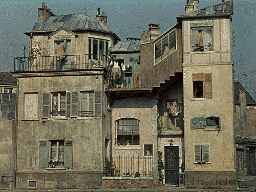
Please ~ support my TS2 habit! Shop at my Etsy shops:
 I won!
@ForeverCamp, Petro and Porkypine - you guys were some tough competition - not to mention the others who dropped out...
It was a really tight race; I thought ForeverCamp had me for sure with that magnificently disgusting school shell ~ and then, Petro - your school reno is gorgeous! It's so fresh and clean - I can't believe it's the same building! I love it!
Thank you - judges - for all the work you guys did! The comments you left helped immensely (and I know they are a real PITA to write out!) Thank YOU :lovestruc
And, Phae, thank you for hosting (and putting up with all our RL issues and delays *yikes* Did we really turn 6-weeks into 5-months!) You came up with a very entertaining concept for a contest, It was a lot of fun; and I learned a lot about 19th century urban architecture
Now... I gotta go sim this LOL!!!
Please ~ support my TS2 habit! Shop at my Etsy shops:
CatherinesJewelry ~ Artisan Jewelry
Catherine's MOUSE ~ Up/Recycled Jewelry
and Vintage Stuffeths
#898
10th Mar 2017 at 8:04 PM
10th Mar 2017 at 8:04 PM
Posts: 8,859
Thanks: 3118 in 87 Posts
As promised
Windows 10 and the Ultimate Collection
http://modthesims.info/showthread.php?t=568275
http://modthesims.info/showthread.php?t=614833
Windows 10 and the Ultimate Collection
http://modthesims.info/showthread.php?t=568275
http://modthesims.info/showthread.php?t=614833
#899
10th Mar 2017 at 8:27 PM
10th Mar 2017 at 8:27 PM
Congrats Cat! Congrats to everyone who took up the challenges and stuck through with it. It was a pleasure to see everything you came up with for shells and renos.
Uh oh! My social bar is low - that's why I posted today.
My SIMBLER | SIM WHIM | SIM VIDS | SIMS 2 STORIES | SIM PICTURE-TAKING TIPS | MY HOOD | SIMSTAGRAM | TWITTER | TWITCH
#900
10th Mar 2017 at 11:43 PM
10th Mar 2017 at 11:43 PM
Cat, that giff. i can't stop looking at it!
i can't stop looking at it!
"I dream of a better tomorrow, where chickens can cross the road and not be questioned about their motives." - Unknown
~Call me Jo~
Who Posted
|
|