 Sign in to Mod The Sims
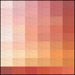
 Totally Plastered: The Bright Oranges
 Totally Plastered: The Bright Oranges


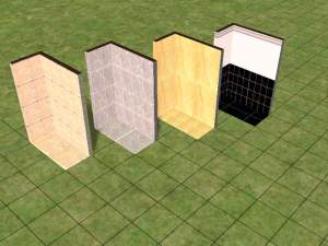
1-2-3.jpg - width=788 height=700
4-5-6.jpg - width=788 height=700
7-8-9.jpg - width=788 height=700
island_orange.jpg - width=900 height=615
light_colors.jpg - width=1008 height=546
orange_pecan.jpg - width=900 height=618
pumpkin_custard.jpg - width=900 height=631
 And I must say that after putting this download together and taking the necessary pics...I really want to make and eat a pumpkin pie. Mmmmmmm...
Anyway, because this is the sixth of these sets that I'm posting now, I'm going to do away with the general information that I've been putting on each of them. If you haven't looked at one of these sets before and you're wondering what the hell I'm doing and how this monster project is organized, go read the description on, for instance, this set .
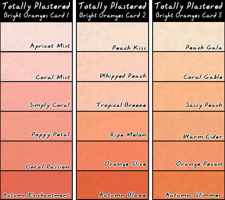
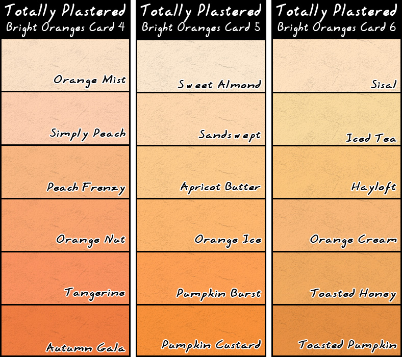
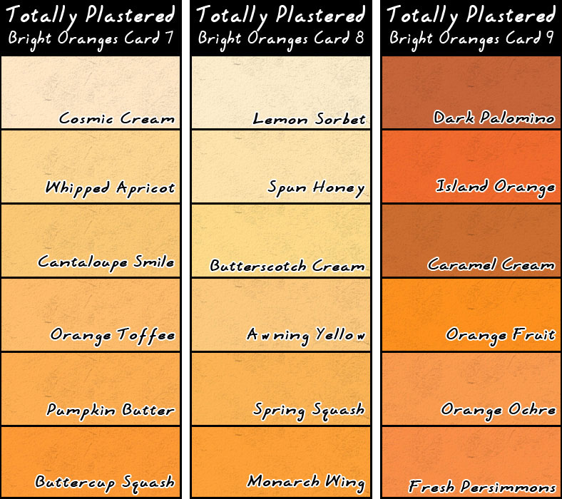
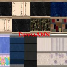
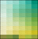
For those of you who know the drill by now, here are the "color cards" for the Bright Oranges:
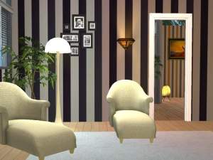
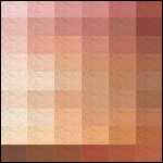
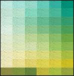
To give you an idea of how these walls look in-game, I took some pics of some of these colors on interior walls this time, instead of just being lazy and plopping them on a stretch of wall outside. And I deliberately chose some of the brighter colors in the set so that you can see that even though they are quite bright, they ARE usable...indoors. If you put them outside, especially on the sunny side of a lot, they will be very, VERY bright. Eye-searingly bright. 0_O But inside...even the brightest colors actually look quite nice, at least if you like oranges, as I do. In fact, here is a pic of the very brightest color of this set -- Island Orange -- on interior walls:
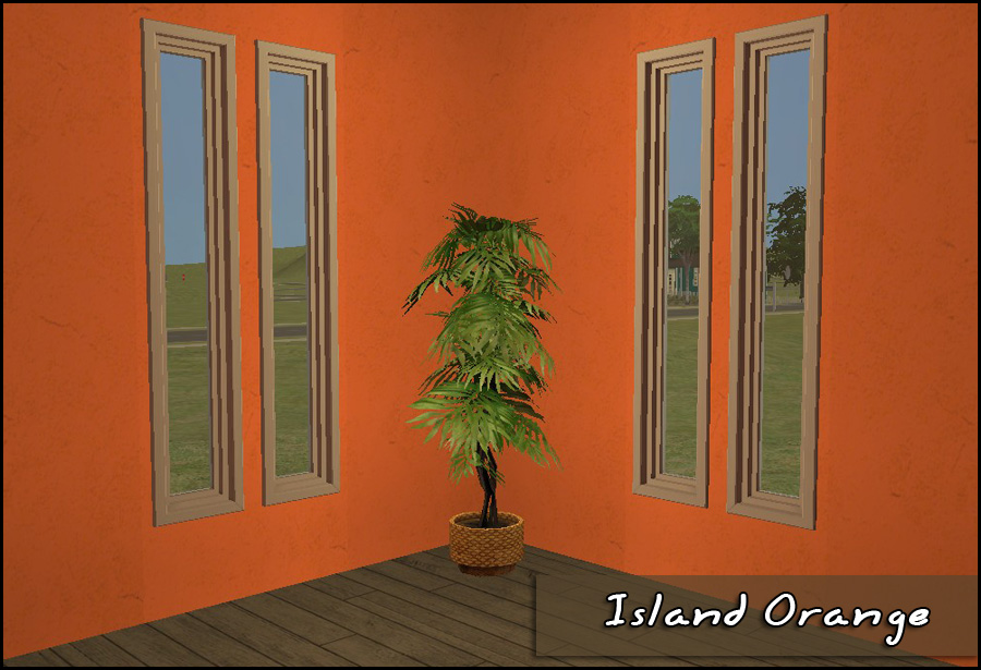
It doesn't look half-bad to me, since I like orange.
And more similar pics of various colors are attached below. Please do note that I have a lighting mod in my game, which I really like in general, but it does have a curious/annoying habit of making any interior wall tile that a window sits on a hair lighter than the wall tiles that have no window in them. I don't know why it does that, but just know that it IS the mod that's causing that in the pictures, not something that's wrong with the walls. Also attached below is a pic that I put together mostly to satisfy my own curiosity about how the game renders the lightest colors in these sets. It's certainly not the best/most artistic pic in the world, but it's not meant to be. I just thought I'd share it so that y'all can see, too, in case anyone was wondering the same thing that I was wondering. Which was: I wanted to know whether or not the game can really distinguish between the lightest colors because I wanted to know whether or not it was really worth it to continue to include them in these sets at all. The answer to my own question is that when used outside, the game doesn't distinguish between the lightest colors and sometimes not even the second-lightest colors on the cards. They all tend to get washed to white(ish), particularly on sunny walls. Inside, however...Well, see for yourself.
In that attached image are the lightest colors on Cards 1-8, in order from left to right. As you can see, they are all different, but VERY subtly so. But the game can and does distinguish between them when used indoors! So, the lightest colors stay, although you should know that there's really not much point in trying to use them outside because they will just look white(ish).With all that said...Enjoy!
|
iCad_TP_BrightOrangesCard9.rar
| The 6 colors of Card 9 and a collection files for those colors
Download
Uploaded: 14th Oct 2010, 275.7 KB.
602 downloads.
|
||||||||
|
iCad_TP_BrightOrangesCard8.rar
| The 6 colors of Card 8 and a collection files for those colors
Download
Uploaded: 14th Oct 2010, 289.5 KB.
464 downloads.
|
||||||||
|
iCad_TP_BrightOrangesCard7.rar
| The 6 colors of Card 7 and a collection files for those colors
Download
Uploaded: 14th Oct 2010, 283.1 KB.
387 downloads.
|
||||||||
|
iCad_TP_BrightOrangesCard6.rar
| The 6 colors of Card 6 and a collection files for those colors
Download
Uploaded: 14th Oct 2010, 286.8 KB.
395 downloads.
|
||||||||
|
iCad_TP_BrightOrangesCard5.rar
| The 6 colors of Card 5 and a collection files for those colors
Download
Uploaded: 14th Oct 2010, 283.6 KB.
462 downloads.
|
||||||||
|
iCad_TP_BrightOrangesCard4.rar
| The 6 colors of Card 4 and a collection files for those colors
Download
Uploaded: 14th Oct 2010, 286.1 KB.
409 downloads.
|
||||||||
|
iCad_TP_BrightOrangesCard3.rar
| The 6 colors of Card 3 and a collection files for those colors
Download
Uploaded: 14th Oct 2010, 287.4 KB.
434 downloads.
|
||||||||
|
iCad_TP_BrightOrangesCard2.rar
| The 6 colors of Card 2 and a collection files for those colors
Download
Uploaded: 14th Oct 2010, 281.3 KB.
410 downloads.
|
||||||||
|
iCad_TP_BrightOrangesCard1.rar
| The 6 colors of Card 1 and a collection files for those colors
Download
Uploaded: 14th Oct 2010, 283.7 KB.
473 downloads.
|
||||||||
|
iCad_TP_BrightOrangesALL.rar
| All 54 colors + 10 collection files, one for all the colors and one for each of the color cards
Download
Uploaded: 14th Oct 2010, 2.50 MB.
7,125 downloads.
|
||||||||
| For a detailed look at individual files, see the Information tab. | ||||||||
Install Instructions
1. Download: Click the download link to save the .rar or .zip file(s) to your computer.
2. Extract the zip, rar, or 7z file.
3. Place in Downloads Folder: Cut and paste the .package file(s) into your Downloads folder:
- Origin (Ultimate Collection): Users\(Current User Account)\Documents\EA Games\The Sims™ 2 Ultimate Collection\Downloads\
- Non-Origin, Windows Vista/7/8/10: Users\(Current User Account)\Documents\EA Games\The Sims 2\Downloads\
- Non-Origin, Windows XP: Documents and Settings\(Current User Account)\My Documents\EA Games\The Sims 2\Downloads\
- Mac: Users\(Current User Account)\Documents\EA Games\The Sims 2\Downloads
- Mac x64: /Library/Containers/com.aspyr.sims2.appstore/Data/Library/Application Support/Aspyr/The Sims 2/Downloads
- For a full, complete guide to downloading complete with pictures and more information, see: Game Help: Downloading for Fracking Idiots.
- Custom content not showing up in the game? See: Game Help: Getting Custom Content to Show Up.
- If you don't have a Downloads folder, just make one. See instructions at: Game Help: No Downloads Folder.
Loading comments, please wait...
Uploaded: 14th Oct 2010 at 7:30 PM


-
Totally Plastered: The Misted Oranges
by iCad 22nd Oct 2010 at 1:24pm
54 colors of Valspar Paint's Ultra Premium paint line on a plaster texture more...
 5
21.1k
63
5
21.1k
63
-

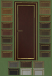
Luxurious Ingression Doors Recolored
by iCad 20th Jun 2011 at 2:37pm
23 colors, my woods plus black and two different whites. more...
+1 packs
11 18.9k 52 Glamour Life
-
-
-

-
Totally Plastered: The Muted Oranges
by iCad 26th Nov 2010 at 12:39pm
54 colors of Valspar Paint's Ultra Premium paint line on a fairly subtle plaster texture. more...
11
26.9k
67
-
Four Maxis Fences, Cloned and Recolored
by iCad 17th Oct 2010 at 6:33pm
20 recolors each of 4 different Maxis fences, to match my recolored Maxis modular stairs. more...
+1 packs
17 29.1k 76 Open for Business
-
Bon Voyage Log Window Recolors
by iCad 21st Jan 2012 at 5:46pm
Two matching windows. Twenty colors each. more...
+1 packs
13 16.5k 35 Bon Voyage
-
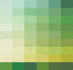
Totally Plastered: The Bright Greens
by iCad 15th May 2011 at 11:30am
54 of Valspar Paint's colors on a fairly subtle plaster texture. more...
18
23.6k
61
-


About Me
Nowadays, I mostly upload stuff to my Simblr, simply because I'm lazy. You can find me here: http://dramallamadingdang.tumblr.com You can also find some downloads that aren't here on my LJ, I don't upload stuff there anymore, but there is some older stuff there. It can be found here: http://icads-sims.livejournal.com/